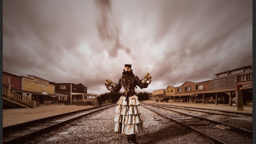
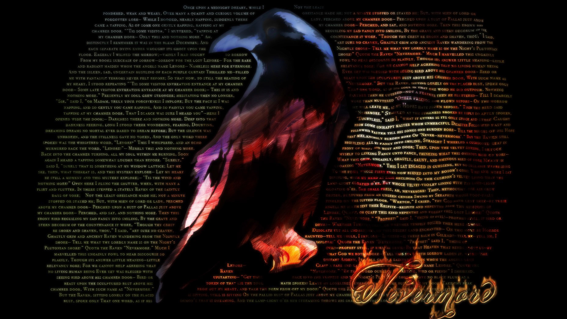
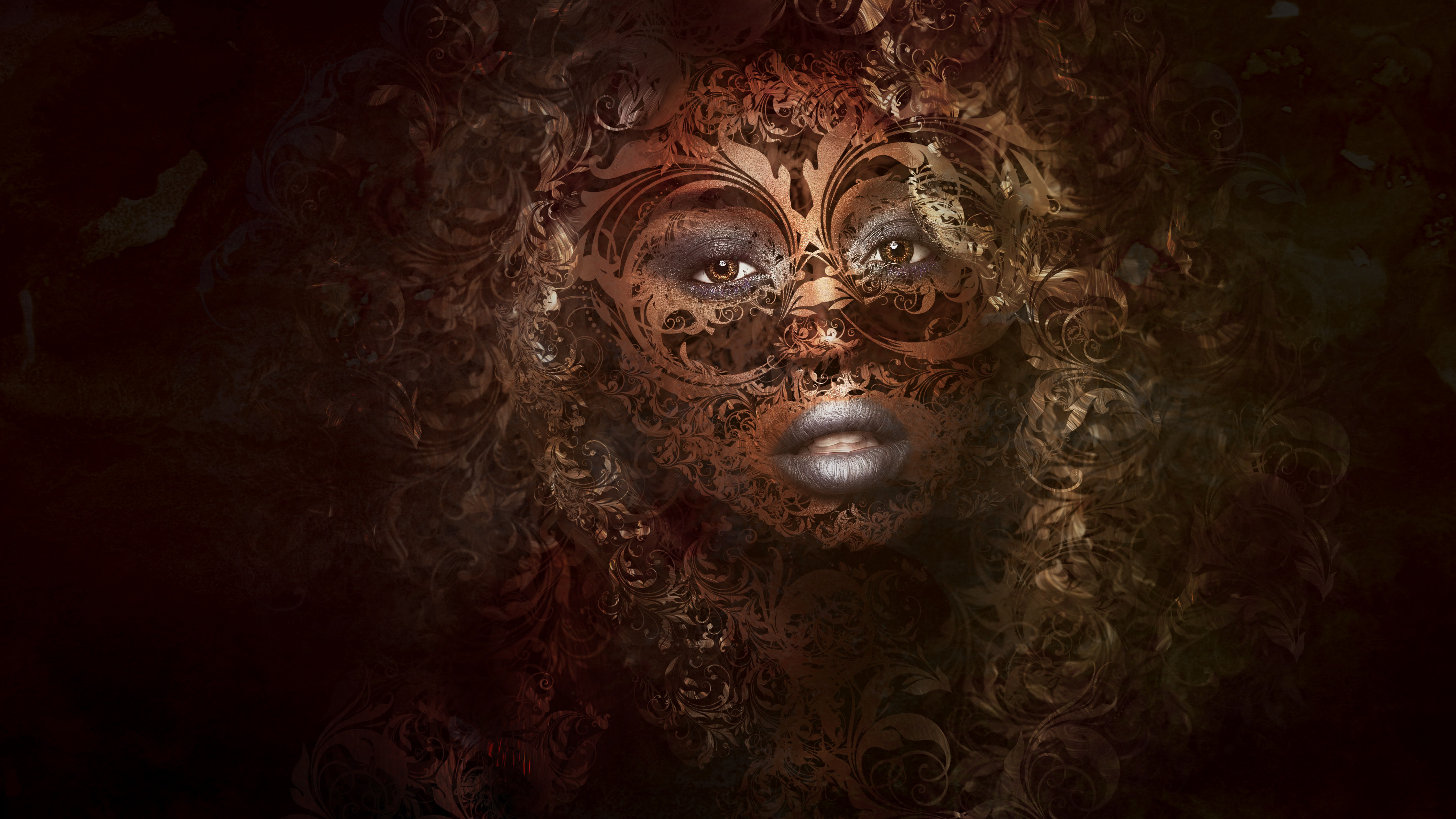
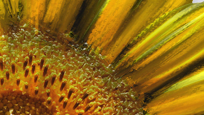
This series is an exploration of a simple filter in Photoshop: Cutout. Continuing trends in graphic design and image treatment lean towards representation through flat, uneven blocks of color. Using photos and plain graphical elements as sources is not only a shortcut for this look, but a great way to shake up old habits.
My intent with this gallery is to spark ideas for your own exploration using minimal tools. The starting image comes from my Photoshop Proving Ground column in the February 2022 issue of Photoshop User Magazine (KelbyOne). For background on creating this look, check it out - it's free to read for members (and there is a free membership option!)
Using simple shapes as a base is probably the easiest way to get a feel for what you can and cannot control with the Cutout filter. I was surprised at how easy it was to generate these intricate textures, but also with how quickly things could go awry. One or two nudges in values would cause this piece to shift from "2022" to random blocks of color.
The colors in this piece were taken from an abstract watercolor background. Applying Cutout removed the texture and fine detail, while adding texture back through distorting the edges. A finishing pass with Find Edges and a quick blending mode change gives it some character.
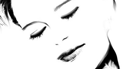
Starting from stock images is a great way to find your way through possibilities. In this image, I had no idea what I wanted visually, only thematically: resolve. Choosing a strong portrait was key, but allowing serendipity to take over is what got me to the finish line.
This treatment was accomplished with a little pre-conditioning of the original image to selectively reduce detail and increase contrast. Applying blur to some areas helped distinguish facial features without getting lost. The strong angular lines are a result of keeping edge fidelity a little higher.
Again I started with a stock image, but in this case I really loved the original image and wanted to work towards a simplified graphic aesthetic. Seeing the result from a distance allows the mind to fill in implied details and preserve the high contrast feel. Up close, abstraction begins to take over and individual pieces don't make sense.
Since I am not a graphic designer or illustrator, there is no way I could have achieved this look with traditional methods. Many people consider this cheating, and they may be right. My view is that an artist gets to decide whether the final piece is expressive, compelling, or even just interesting. There is art in the process as well as the product; so long as you are making active choices at some point along the way, it doesn't really matter.
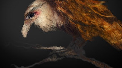
Original digital paintings are also good candidates. Reducing the background features to minimal regions of pastel colors gives me an idea about simplifying other pieces to check for balance and continuity. Using the same Find Edges finish as in the first text example helps distinguish elements of the composition that I hadn't previously considered.
Who says you can't combine techniques?
I have no idea what the Photoshop engineers dreamt of when creating the Cutout filter so many years ago. I do know that it hardly ever shows up in modern work, and I can't recall many people talking about it with any enthusiasm. That means it's a great candidate for investigation, and now that I've worked with it quite a bit I'd love to see it enhanced. These older filters tend to be cast aside, especially when the don't directly contribute to current trends in photo illustration or enhancement - people generally spend a few seconds fiddling with controls and make a decision on the spot about whether they'd ever use that effect.
If they don't like what they see in the moment, they almost always scrub it from their memory and label it as a reject. I really appreciate artists who pick up those rejects and tinker until some beautiful disaster happens. Now that I know more about Cutout, I'm sure I'll use it more frequently, especially when I need to create simplified textures and unusual graphic looks.
